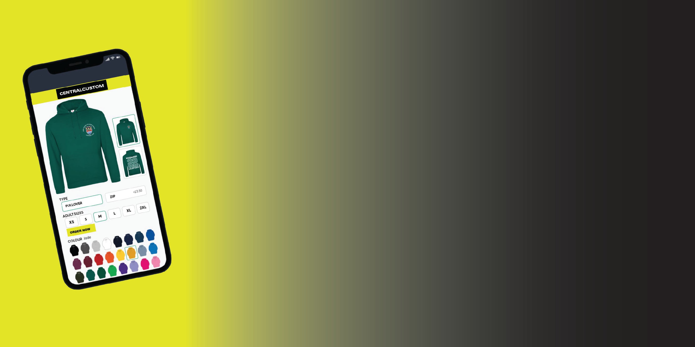
Uniform colour is one of those decisions that feels simple until you are staring at a garment colour chart with forty shades of blue. Get it right and your team looks coordinated, professional and instantly recognisable. Get it wrong and you end up with jackets that clash with your polos, a logo that disappears into the fabric, or a colour you can never reorder because the supplier discontinued it.
This guide walks through how to choose corporate uniform colours that actually work in the real world — matching your brand without ignoring the practical limits of garments, dye and decoration.
Why uniform colour matters more than you think
Colour is the fastest way people recognise a brand. Before anyone reads your logo, they have already registered the colour of the jacket walking towards them. A consistent uniform colour turns every member of staff into a small, moving piece of your brand — in the car park, on a doorstep, across a busy trade-show floor.
It also affects how your team feels. A uniform that looks smart and cohesive signals that the business takes itself seriously, and staff tend to wear it with more pride. A mismatched, faded or awkwardly coloured uniform does the opposite.
Start with your brand colours — but be realistic
The obvious starting point is your brand palette: the colours in your logo, website and signage. Pull out your primary brand colour and one or two secondaries, ideally with their exact reference (a Pantone, or at least a hex code). That gives you a target to aim at.
Here is the catch: garments are dyed in batches to a fixed range of stock colours, so you will rarely find an exact match to a specific Pantone. The goal is the closest sensible shade, not a perfect one. A "brand navy" and a garment's "navy" will differ slightly, and that is normal — the human eye reads them as the same colour in context.
If your brand colour is very bright or unusual (a specific lime, teal or purple), be prepared to compromise on the garment and let your logo carry the exact shade instead.
Let the garment be the backdrop and the logo be the accent
The most reliable approach is to choose a neutral or on-brand garment colour, then reproduce your exact brand colours in the embroidery or print. A grey softshell with your logo stitched in your true brand blue and orange will look sharper — and be far easier to reorder — than trying to source a garment dyed in that exact blue.
Neutrals like navy, black, charcoal, grey and white are safe, widely stocked and flattering, and they let a coloured logo pop. If you want more brand presence in the garment itself, pick one strong branded colour for a hero piece (say, the polo shirt) and keep outer layers neutral.
Practical considerations before you commit
A few things save real money and hassle later:
- Stock availability. Check the colour exists across every garment you plan to order — polos, hoodies, softshells, caps. A colour that looks great on a t-shirt may not exist in a softshell jacket, and mismatched "same" colours across garments look worse than a deliberate neutral.
- Reorderability. Choose colours from a supplier's core range, not a seasonal special. You will want to add staff and replace worn items for years, and a discontinued colour breaks the set.
- Fabric and finish. The same colour reads differently on a matte cotton tee, a shiny polyester polo and a textured softshell. Ask to see the actual shade on the actual fabric where you can.
- Fading. Darker and mid-tones hide wear and dirt better than very light colours in hands-on roles. White looks crisp but shows everything.
Choosing colours by role and environment
Not every team member needs the same colour, and using colour deliberately can be genuinely useful:
- Customer-facing staff benefit from your strongest brand colour so they are easy to identify and approach.
- Site, warehouse and outdoor teams often need high-visibility elements. If safety colours are required, treat hi-vis yellow or orange as a given and add your brand colour through the logo and trims rather than fighting it.
- Management or specialist roles can be distinguished with a different but complementary shade — for example, the same jacket in charcoal while the wider team wears navy.
Keep the total palette tight. Two or three coordinated colours across the whole uniform looks intentional; five or six looks like a jumble sale.
How colour affects embroidery and print
Decoration is where your exact brand colours come back in, so plan for it:
- Contrast is everything. Your logo needs to stand out against the garment. A navy logo on a navy jacket vanishes; the same logo in white or your accent colour reads clearly from across a room. Always check logo colour against garment colour, not against white paper.
- Embroidery uses fixed thread colours, matched as closely as possible to your brand. It looks premium and lasts the life of the garment, which is why it is the default for branded workwear.
- Print can reproduce gradients and photographic detail that thread cannot, making it the better choice for complex, multi-colour artwork.
- One-colour versions help. Have a single-colour version of your logo ready for situations where a full-colour badge would not contrast well.
Building a coherent palette across garments
Think of the uniform as a set, not a pile of separate items. A simple, effective formula: pick one neutral base colour for the bulk of garments, one brand colour for a hero piece, and one logo treatment used consistently everywhere. For example — charcoal softshells and hoodies, brand-blue embroidered polo shirts, and a white one-colour logo across the lot. Everything coordinates, everything reorders, and new starters slot straight in.
Common mistakes to avoid
- Chasing an exact Pantone match in the garment and paying for a special dye run you cannot easily repeat.
- Ordering "the same" colour across different garment ranges without checking they actually match.
- Putting a dark logo on a dark garment (or light on light) so the branding barely shows.
- Picking a trend colour that dates quickly, when staff will wear the uniform for years.
- Forgetting hi-vis and PPE requirements and having to redo an order.
Frequently asked questions
Should the garment match my brand colour exactly?
Rarely worth it. Choose the closest stocked shade, or go neutral, and put your exact brand colours into the logo instead. It looks better and is far easier to reorder.
What are the safest corporate uniform colours?
Navy, black, charcoal and grey are the reliable all-rounders — widely stocked, smart, forgiving of wear, and a strong backdrop for a coloured logo.
How many colours should a uniform use?
Two or three across the whole set is ideal: a neutral base, one brand colour, and a consistent logo treatment.
Can you match my exact brand colour in embroidery?
We match thread as closely as possible to your brand reference and will show you the closest options. Send us your logo and colour codes and we will advise on the best result.
Get help choosing your uniform colours
Not sure which shades will work across your polos, hoodies and jackets? Send us your logo and brand colours and our team will recommend a coordinated palette and the closest stocked garment colours. Explore our custom softshell jackets and embroidered polo shirts, or talk to us about a complete branded uniform.